The Toronto Public Library’s current logo doesn’t reflect the diversity and energy of its visitors, members, and spaces. The new corporate identity and brand strategy aim to create an elegant, modern solution.
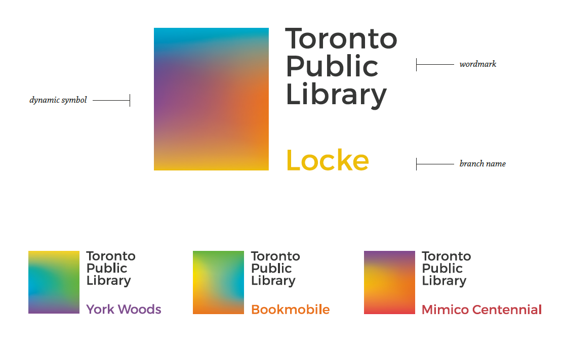
Dynamic, adaptable, and energetic, the Toronto Public Library’s identity connects with the diverse types of readers, learners, and creators who visit it, showcasing its transformative ability to create experiences for Torontonians. The Toronto Public Library logo draws upon the legacy of the book but focuses on the people who read it, learn from it, and create stories of it. With 99 branches and an expansive network of diverse communities, the library’s fluid identity changes to match the atmosphere, community, and experiences of each branch. The colourful experiences are shown through the gradient blocks, giving visitors a glimpse of what awaits them within the library. Clear and friendly typography allows easy readability and quick recognition for readers of all ages, while the bright colours create an attractive and energetic atmosphere. The identity gives library visitors a space to connect with and share their own diverse experiences of the library, allowing them a sense of pride and ownership of their home branch.
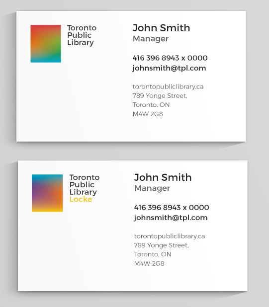
Applications include: stationary, business cards, library cards, hi fidelity app screens, tote bags, buttons, vehicles (specifically, the bookmobile), exterior signage, and website redesign.